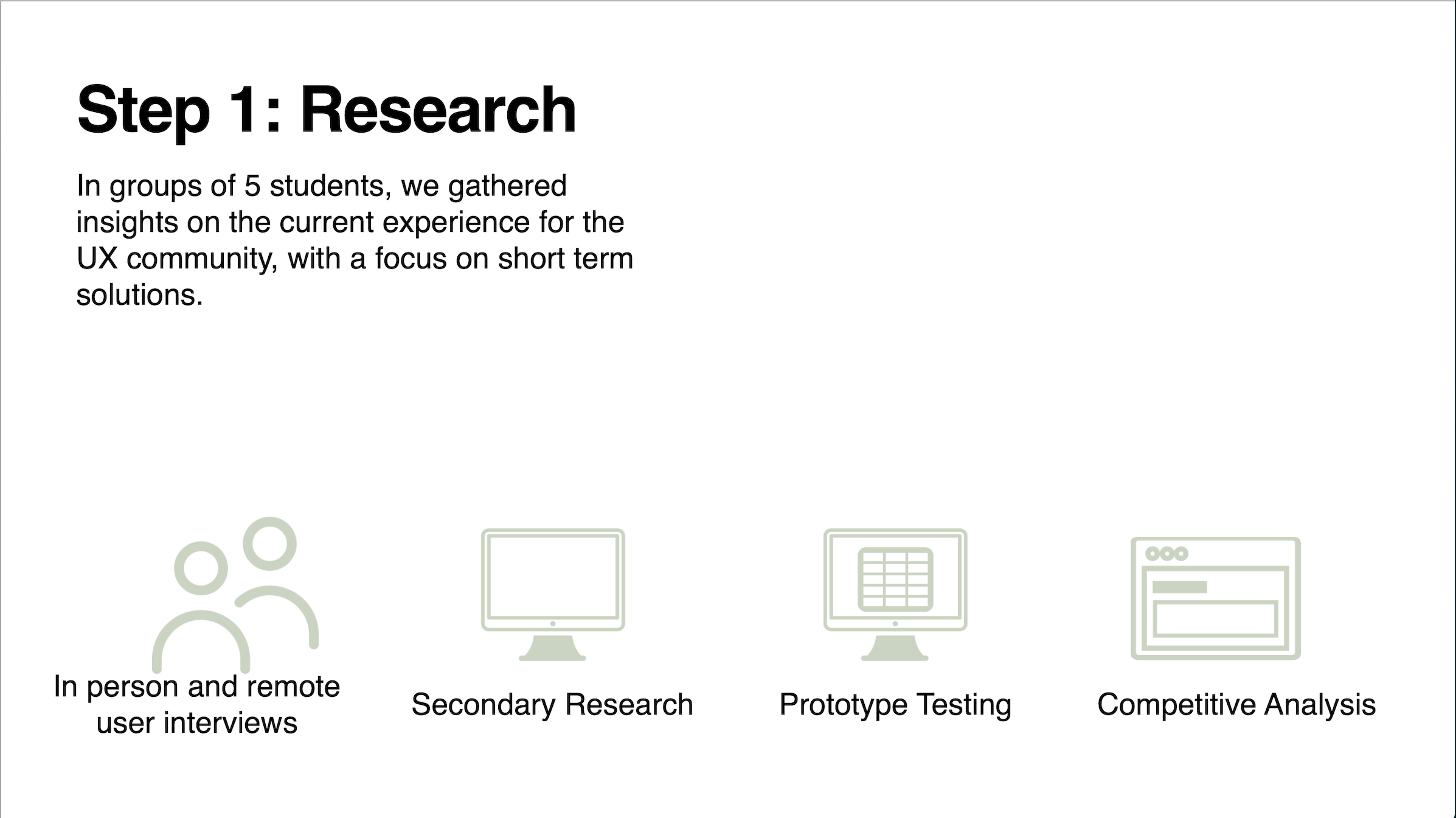
Research
A variety of research methods were applied throughout the project in order to obtain information.
Click the image to enlarge.
Despite its popularity UX is a relatively new field. Many people have their own terms and ways of expressing UX concepts. It is easy for industry jargons to create confusion as the world of UX expands, and people of varied backgrounds begin to work together. The goal of this project is to create a unified lexicon, for anyone within or dealing with, the UX community.
A variety of research methods were applied throughout the project in order to obtain information.
Click the image to enlarge.
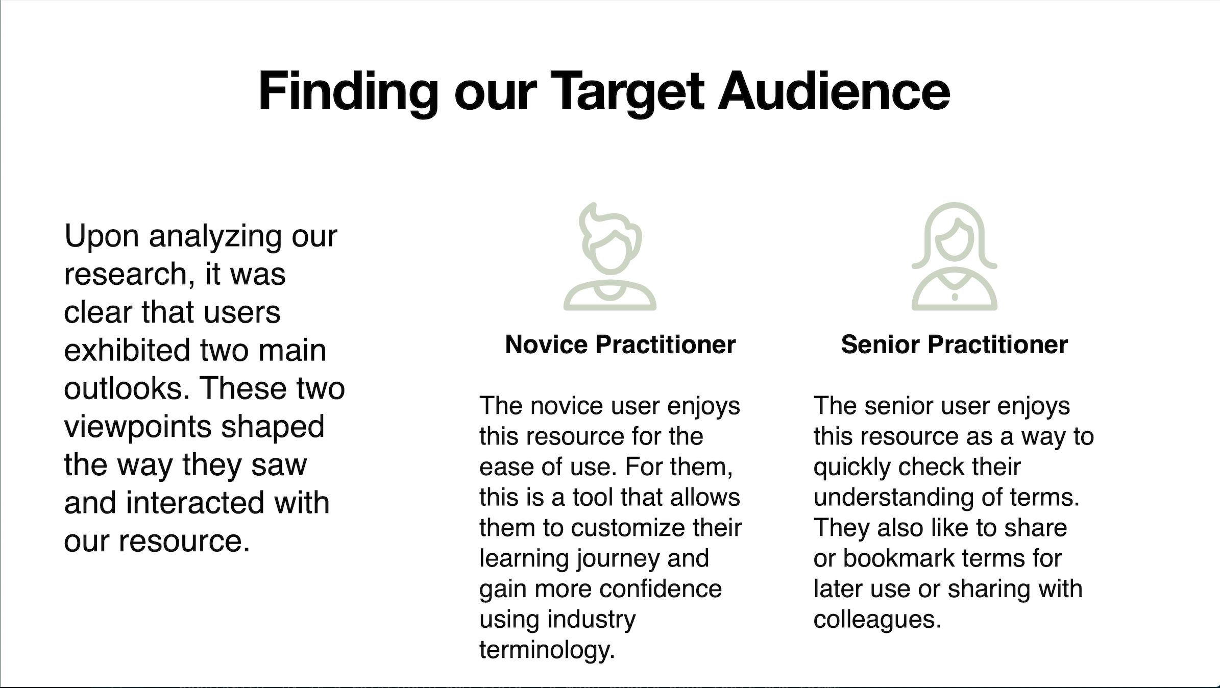
Upon analyzing the research it was clear that users exhibited two main outlooks. These two viewpoints shaped the way they saw and interacted with the glossary.
Click the image to enlarge.
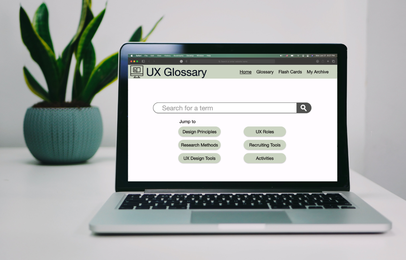
Photo by James Mckinven on Unsplash.
Click the images to enlarge.
It was decided that a layout similar to other online glossaries was optimal. In order to accommodate various learning styles an alphabet picker, a search bar, as well as a list of all terms were all included.
Based on the user testing, it seemed that the product was off to a good start. The main observation was in regard to the letter picker. Roughly 50% of the test participants liked the idea of having a letter picker. However, none of the participants seemed to choose this as the primary method of searching.
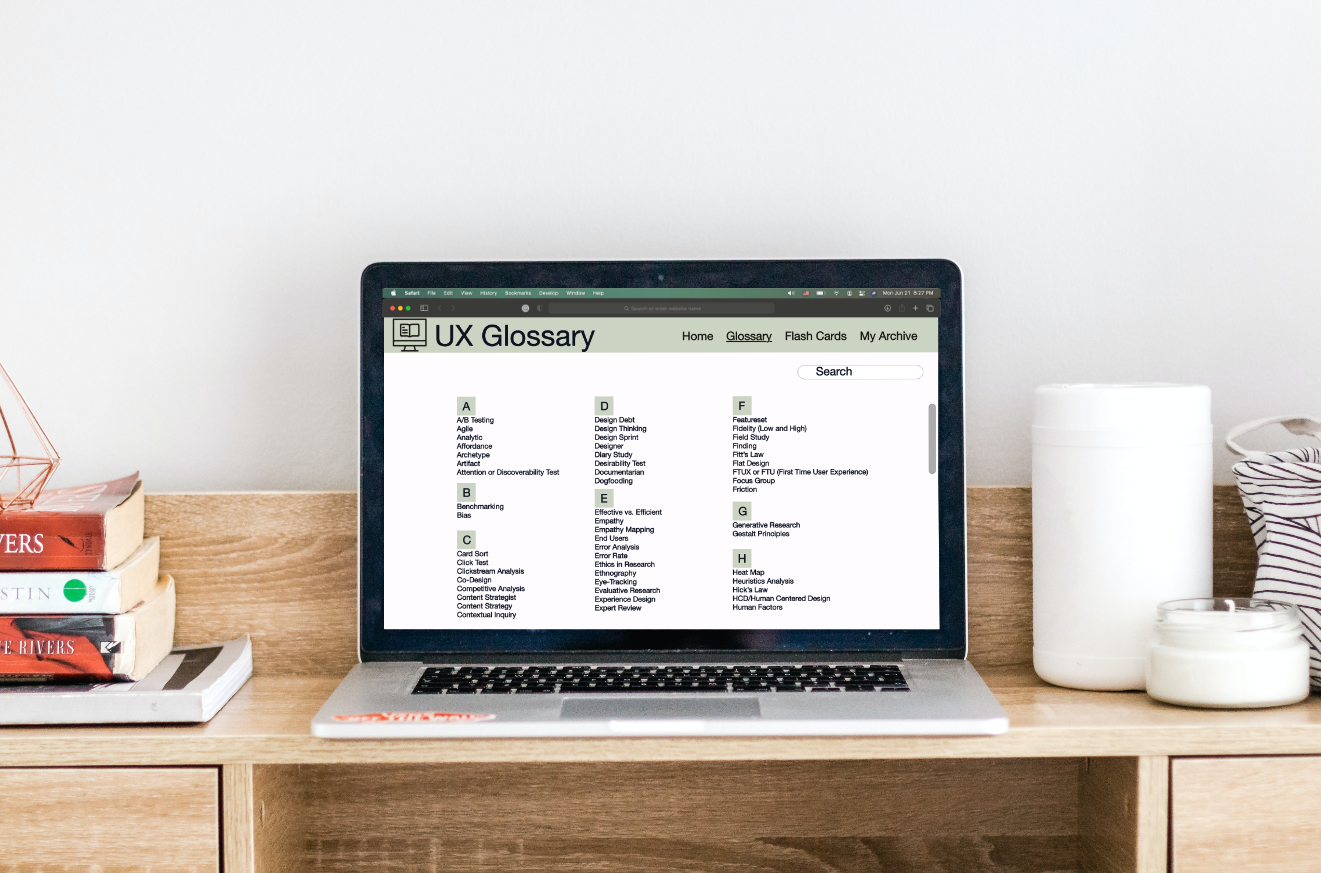
Photo by Aleks Marinkovic on Unsplash.
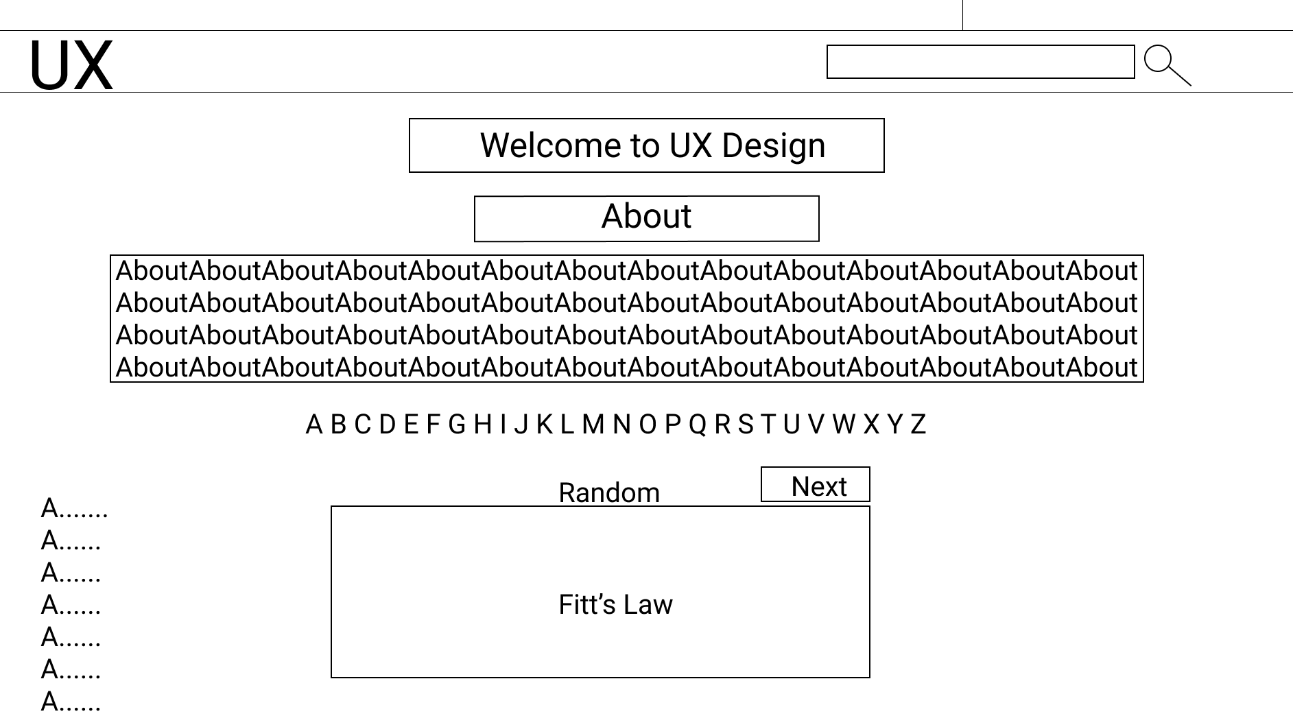
In the second iteration, the design was opened up and and featured a variety of experimental features. In this version the letter picker was replaced by a secondary search bar. There was a central search bar as part of the home screen and a second in the right corner as a universal search bar that would appear on each page.
The word of the day feature was changed in this iteration. The intention of this feature is to provide users with a selection of vocabulary words that changes each day. Since it is understood that the UX experience of the target audiences varied, three different words each more complex than the last were added. In order to differentiate the three levels varying stroke weights on the boxes were used to identify difficulty. Thin being the easiest and the thick being hardest. While this feature was enjoyed by the users during testing sessions, they didn't understand the outlining and what it signified.
Based on pre-existing learning tools for students, a game was added to help practitioners learn vocabulary in a fun way. The game presents a word and the user has to pick the correct definition. It was believed that this would be a fun way to learn as well as a way for users to test their current knowledge.
Click the image to enlarge.
Click the image to enlarge.
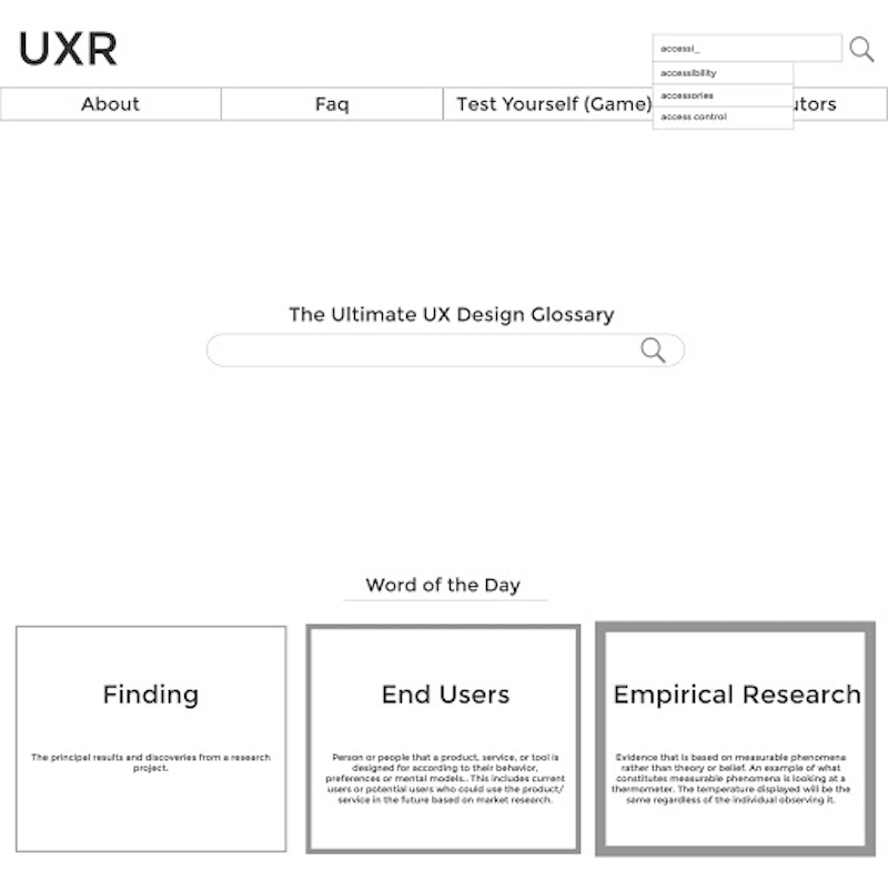
Based on the feedback received in the user testing sessions, the central searchbar on the Home Screen was kept as a permanent feature. Many people liked that it was front and center. With the addition of the word "search" inside the text box, people felt more sure that it was indeed a search bar. Given its likeness to Google's homepage, users could figure out where to search for terms and felt comfortable since the interaction was similar to one that they had completed many times before.
The confusion of the "Word of the Day" feature, presented in previous iterations, was stripped down to one word and placed in a large box with the definition. This was preferred by users.
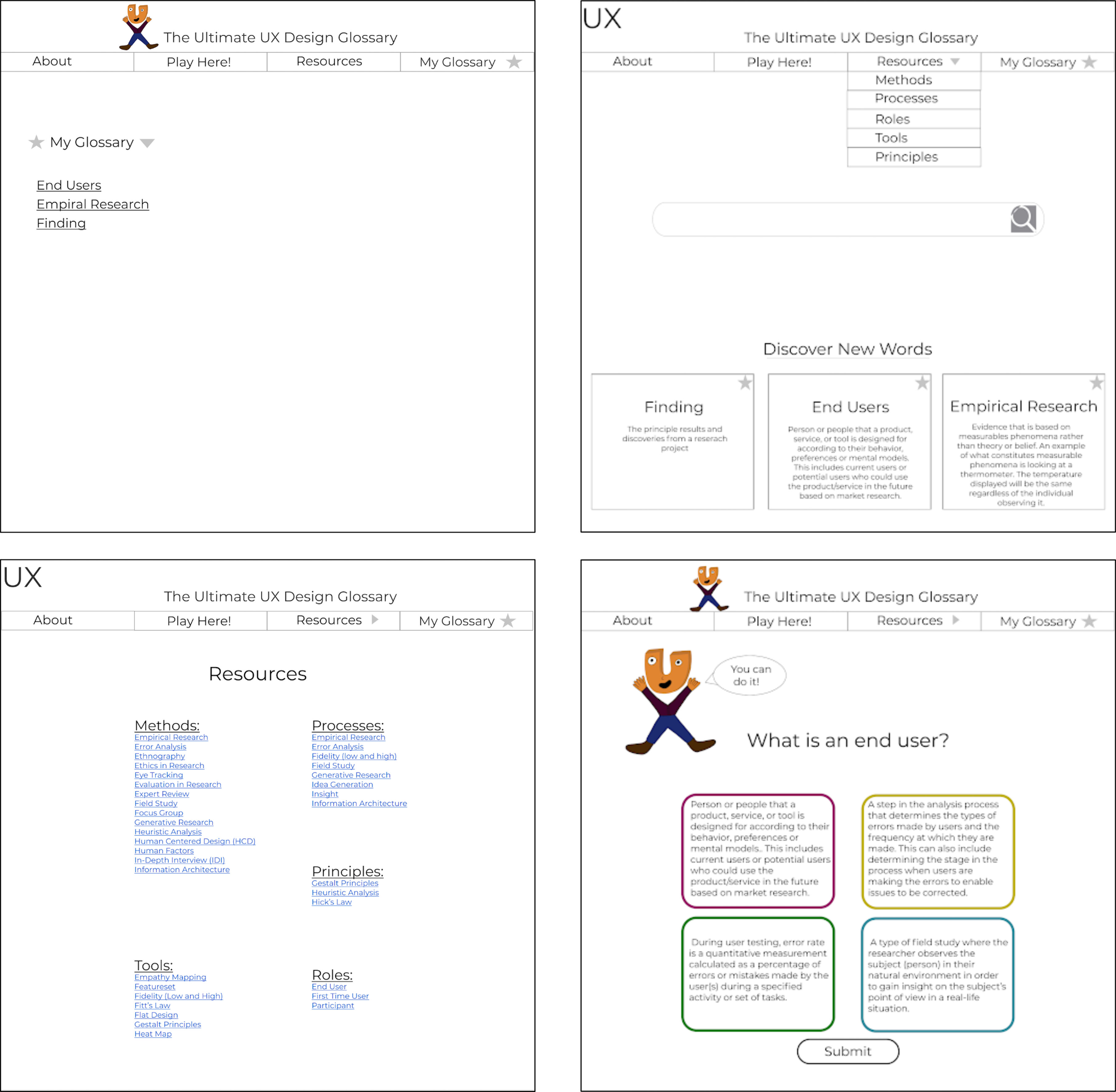
Categorization of the terms was the next added feature of the product. They were grouped by the conceptual category (tools, UX methodologies, processes, etc.) they fit in rather than alphabetically. The main problem with this was that many terms in UX belong in more than one category and there was a lot of overlapping of terms.
Visual structure was a main problem with this iteration. All the elements that made up the page were varied in size and inconsistent. Test participants reported that they were unsure of where their eye should go.
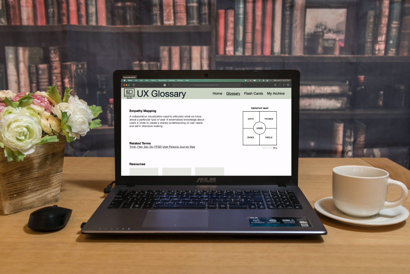
Photo by Samantha Borges on Unsplash.
Color and a website mascot character were added for the penultimate iteration of the project. While the color wasn't a huge issue, test participants disliked the mascot. It was said to be creepy and they didn't feel that it went well with the purpose of the website. Based on that feedback these elements were discarded. While users liked the idea of having a way to quiz themselves, they didn't like that it was formatted as a game.
In order to avoid the visual hierarchy problem presented in the previous iteration, it was decided to return to the idea of having three "Word of the Day" boxes at the bottom of the screen. This time it was kept simple and didn't have any defining marks to distinguish the difficulty of the term.
It was then decided to create a way for archiving terms for later reference. This feature went over tremendously well with our test participants.
Click the images to enlarge.
Click the image to enlarge.
At this point, our team had split up and I was making my own prototype.
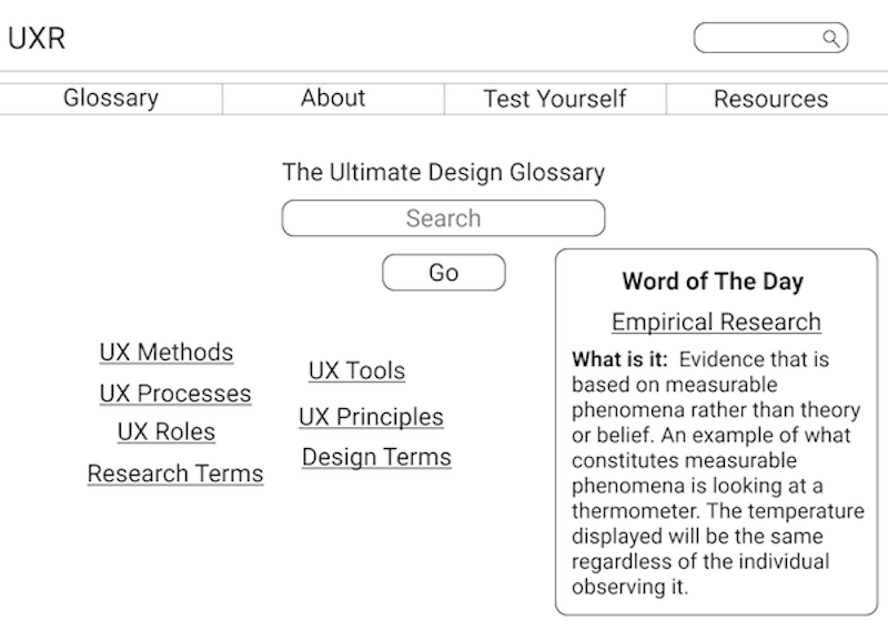
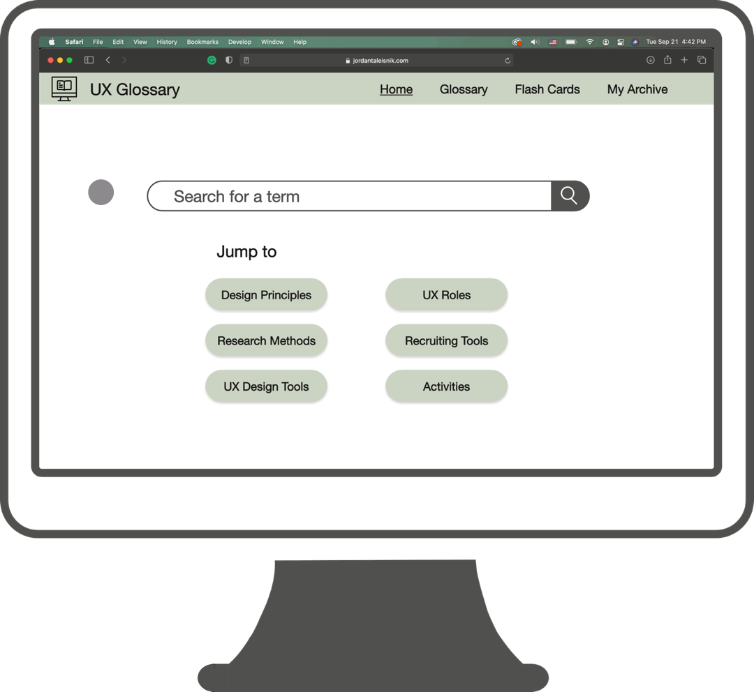
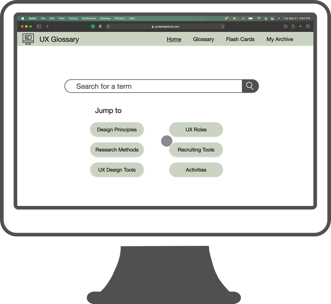
After taking everything that had been learned from testing the website, it was decided what the main features of the site would include: a glossary of all terms listed alphabetically, a flash card feature to replace the vocabulary game, and an archive of the user's saved terms.
The central search bar from previous designs was kept as the test participants found it useful. In addition, as a way to provide a starting point for new UX practitioners, some quick links to categories of words were kept. Some people found that having a jumping off point in their education journey to be helpful.
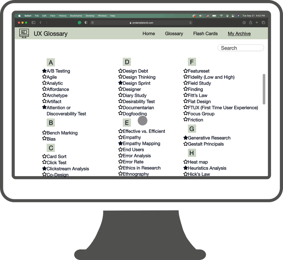
This is the "Glossary" tab. Users can click the link to the page of any word. The letter picker remained as a feature in the event that someone knew exactly what word they were looking for. People just starting out or those who want to see a list of words laid out, are able to scroll through them and find what they are looking for.
Click the image to enlarge.
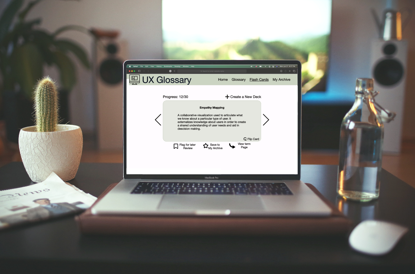
Photo by WebFactory Ltd on Unsplash.

This is what a user would find under the "My Archive" tab. This is the section where all of their "starred" words get saved. From here it functions similarly to the "Glossary" section. Words are organized alphabetically and there is a letter picker. From this page, users can click on any word in their list which is linked to the word's definition page. Users can also remove a word from their archive by clicking the star to the left of the word.
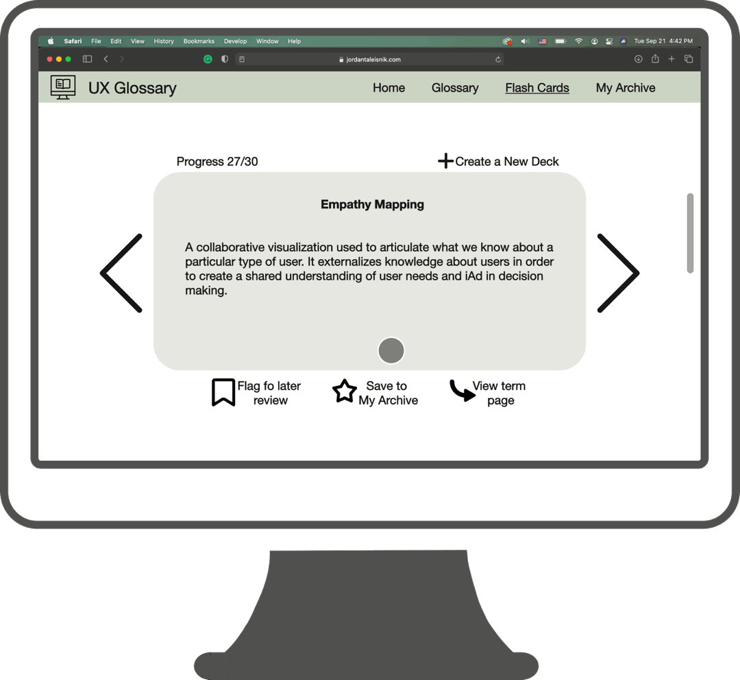
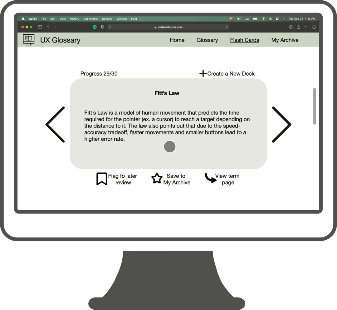
Instead of continuing with the game idea previously proposed, a flash card feature was chosen instead. This tool allows users to make decks of cards they would like to review. All the decks are saved and can be used for a variety of purposes. Once a user selects which deck they would like to review, the first card comes up. From here, a user can save that word to their archive, go directly to the term's information page, create a new deck, or flag the word for review later. At the end of reviewing the deck, the user will see a list of all words that were flagged for review.
Click the image to enlarge.
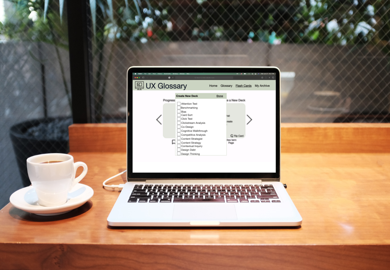
Photo by WebFactory Ltd on Unsplash.
Click the image to enlarge.
This shows how decks are constructed. If a user has a list of words in mind, they can simply click the check box by all the words they want in the deck and click “done”. The new deck will be made.
This shows how the users decks will be displayed.
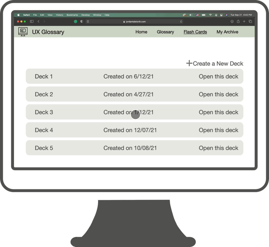
Click the image to enlarge.
Photo by WebFactory Ltd on Unsplash.
Click the image to enlarge.
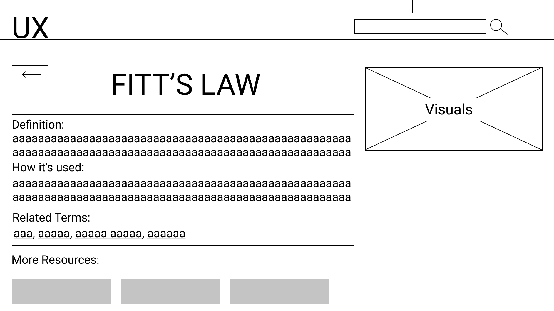
This is what a user would find upon clicking on a link to a term. Included were a definition, a visual example of the concept where applicable, a list of related terms, and resources that are tied into the concept/term.
Due to the time constraints of the course, user tests of the most recent prototype were not completed.